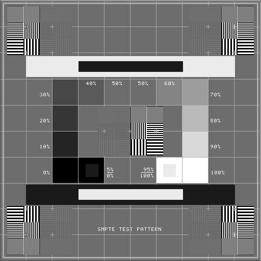
DICOM Standard Grayscale Display
The latest DICOM standards specify a way of setting up a computer
display so that the same medical image will be perceived
to have the same image contrast and brightness. Setting up a
display in exact compliance with the DICOM standard is
time-consuming and requires the use of expensive test equipment
that is not readily available. However, Jim provides a simple way to
set up you computer display that will correct any major
differences in your display setup. The setup will take account of:
- The ambient lighting conditions of the room in which Jim
is used. For this reason, always make these adjustments under
normal ambient lighting conditions.
- The maximum luminance of the display screen.
- The gamma value for your display screen.
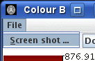
To setup the display, first load the SMPTE test card. This is
provided in the set of example
images that can be downloaded when you
installed Jim.
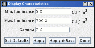
Then select Display Characteristics ... from the
Colours menu. This will bring up the Display
Characteristics dialog:
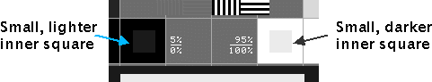
Now concentrate on the central lower portion of the test card. The
squares shown below contain smaller squares that are slightly
brighter than (on the left) and slightly dimmer than (on the
right) their surrounding squares.
- Adjust the Min. luminance value until the brighter square on
the left is just visible inside the outer square. This
adjustment takes account of room ambient lighting
conditions. Click on the
 button to see
the effect of the change.
button to see
the effect of the change.
- Adjust the Max. luminance setting until the darker square on
the right is just visible inside the outer square. This
adjustment takes account of the maximum brightness of your
computer display. Click on the button to see
the effect of the change.
The final setting is the gamma correction for your monitor. Adjust
the gamma value until you perceive that there is a constant step
in brightness from one square to the next as you move around the
square of grey tones from the black square to the white square.
Click on the button to see
the effect of the change.
Below is an illustration of what the display looks like for a bad
Gamma value:
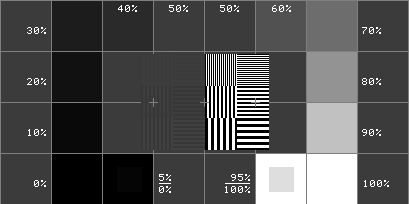
In the picture above, all the low grey values are dark, and there is
very little difference in contrast between these squares. In this
case, the Gamma value is set too low. If, on the other hand, the
Gamma value is set too high, then the bright tones will appear
washed out, with little difference in contrast between the bright
squares. If in doubt, the default setting (2.6) will be about right for
most computer displays.
To revert to the default setting for your display
characteristics, press the  button.
To save the settings so that they will be used next time you start
Jim, press the  button.
Note: the display characteristics setting are saved in the
user's preferences for each computer that the user sets up. The
procedure for setting up the display should be followed for every
computer that the user logs on to.
Note: if the ambient light conditions change significantly, or the contrast and
brightness settings for the computer monitor are changed, then
the display characteristics should be set up again using this procedure.
When you have finished setting up the display characteristics,
click the  button.
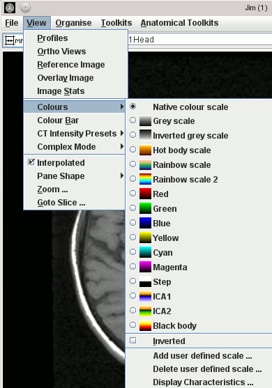
 Grey scale - the standard black to white mapping
for MRI, CT and other images.
Grey scale - the standard black to white mapping
for MRI, CT and other images.
 Inverted grey scale - the
standard white to black mapping for plain x-ray images.
Inverted grey scale - the
standard white to black mapping for plain x-ray images.
 Hot body scale - the scale
representing intensities as "temperatures" from black (cold)
to white (hot) with various colour in between that would be
seen on heating a black metal to white hot.
Hot body scale - the scale
representing intensities as "temperatures" from black (cold)
to white (hot) with various colour in between that would be
seen on heating a black metal to white hot.
 Rainbow scale - a spectrum of colours.
 Rainbow scale 2 - an alternative spectrum of colours.
 Cool - the 'cool' spectrum of colours.
 Red,
Red,  Green,
 Blue,
Blue,  Yellow,
 Cyan,
Cyan,  Magenta.
 Step - all pixels above the mid brightness
setting are shown white, and all those below are shown black.
Step - all pixels above the mid brightness
setting are shown white, and all those below are shown black.
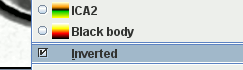 check-box towards the bottom of
the Colour Scale menu.
check-box towards the bottom of
the Colour Scale menu.
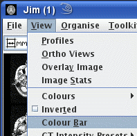
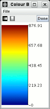


 in the colour scales menu.
This will bring up a
in the colour scales menu.
This will bring up a  .
.